Thursday 25 February 2016

Diary post #23

I have wondered why my magazine cover doesn't look like the professional made ones, therefore I added drop shadows to the text, and it made it look a lot more effective. I have got a colour scheme of gold, blue, and white that I seem to be sticking to. I am on my way to finishing.

Tuesday 23 February 2016

Diary post #22

I have stuck with the photo and the background that I chose last. I have found font that matches the font used on "Entertainment weekly." I have been paying close attention to the magazines I have analysed for inspiration, I have decided to take elements from all of them to create the best magazine I possibly can. This will help me to create a realistic looking magazine.

Monday 22 February 2016

Diary post #21

I decided to change the photo and the colour of the background as the first photo I used was blury. Also the background suits the colours in the photograph more, and there won't be too many colours going on when I add text. Still looking for text that matches the "Entertainment weekly text."

Diary Post #20

This is the beginning of my magazine cover drafting. I chose to use a lighter picture of Seth, as the one I took for the poster was a lot darker photo, and the pictures on entertainment weekly are a lot brighter. I wasn't sure what colour background to use, therefore I went for purple as  I thought it blended in well with all of the colours. I am finding it hard to find text that matches the "Entertainment Weekly" text though.

Saturday 20 February 2016

Audience Feedback


From my feedback I found out that the majority of the people liked my poster. Some were confused by how blue the eyes are, but it engaged them because they want to find out more about the film. This is good for me as audiences want to find out more about the film,which works as a marketing strategy. A few people commented on how I should change some of the font on my poster so it looks more professional, so I need to experiment with that. Other than that most of the feedback was positive, and matches the genre of my poster.

Diary Post #19

I am now happy with my poster, therefore I am starting to add the text at the bottom which gives information about my institution. I am trying to find font that looks professional, but also suits the theme of my poster. I decided on a portrait poster as I wasn't able to creating a convincing professional background.

Tuesday 16 February 2016

Diary post #18

Today I have been creating the intertitles for my film, as I want them to look like they are from the sci-fi genre. I have used font from the website "DaFont" and then I have used the gradient tool to create the look I want. It matches the theme that I have for my film, as it matches the poster.

Diary post #17

This is one of the first draft of my poster. I have made the robots eyes blue so that the audience can tell that he is different from every one else. I have put the two faces together, this symbolises that they are against each other as they are bot looking in different directions, but they are also both in each others minds. I am still figuring out whether to make the poster landscape or portrait, as I would like to put some sort of background behind the two characters, however I'm not sure if the pictures I could take would look professional enough.

Wednesday 10 February 2016

Diary Post #16

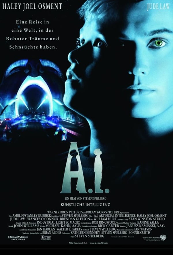
Today I took pictures for my magazine poster, I took inspiration from the film "Artificial Intelligence" as it has a thriller element to it. I liked how it uses blue to signify the sci-fi genre, and the black for thriller. I also thought it was an interesting way of putting two characters together.

Friday 5 February 2016

Draft three

This is my third draft of my trailer. I have put most of the clips together, however I am still figuring out what filters to put on the film, the blue filters make some of the shots look too dark and depressing, therefore I need to find a filter that makes the shots look like the genre of sci-fi. I am still trying to find the right kind of music to use as I am finding it hard to find the kind of music that conveys sci-fi thriller throughout. The intertitles aren't permanent, as I need to make better looking intertitles.